
Packaging Artwork Guide
This Packaging Artwork Guide explains everything you need to know about preparing professional print-ready packaging artwork. Creating attractive packaging is only one part of a successful packaging project. However, preparing professional packaging artwork is what transforms a creative design into a commercially printable product. Therefore, every business that orders custom packaging should understand how artwork is prepared, checked and approved before production begins.
This Packaging Artwork Guide explains every stage of artwork preparation, from colour management and bleed settings to print-ready PDF files, packaging dielines and commercial printing requirements. Furthermore, you will learn how packaging manufacturers prepare artwork for folding cartons, rigid boxes, corrugated packaging, labels, sleeves and luxury packaging. Consequently, whether you are launching a new product or redesigning existing packaging, this guide will help you avoid costly mistakes while achieving exceptional print quality.
Throughout this comprehensive guide, we also explain industry terminology, professional workflows, artwork approval procedures and practical recommendations used by commercial printing specialists. As a result, you will gain the knowledge needed to create production-ready packaging artwork that looks outstanding on the shelf and performs efficiently during manufacturing.
Who Should Read This Packaging Artwork Guide?
This guide has been written for brand owners, marketing teams, graphic designers, printers, product manufacturers, e-commerce businesses, retailers and anyone involved in developing custom printed packaging. Whether you are ordering your first printed box or managing large commercial packaging projects, understanding professional artwork preparation will help you communicate more effectively with your packaging supplier.
Explore This Packaging Artwork Guide
Learn how to prepare professional packaging artwork for commercial printing, from artwork planning and dielines to colour management, proofing and final production.
- 🎨 What Is Packaging Artwork?
- ⭐ Why Professional Artwork Matters
- 📐 Design vs Artwork vs Dielines
- 🖨 Print-Ready Packaging Artwork
- 📄 Professional Artwork Requirements
- ✂️ Bleed, Trim Line & Safe Zone
- 📑 Crop Marks & Artwork Layers
- 🔤 Fonts & Typography
- 📦 Barcodes & Regulatory Information
- 🎨 CMYK & Pantone Colours
- ✨ Foil, Spot UV & Embossing
- 📦 Artwork for Packaging Types
- ✅ Proofing & Prepress
- ⚠️ Common Artwork Mistakes
- ⚙️ Professional Artwork Workflow
- 🏭 Industry-Specific Artwork
- 🚀 Future Trends
- ❓ Frequently Asked Questions
- 📌 Final Summary
19 COMPREHENSIVE CHAPTERS
Professional Packaging Artwork • Print-Ready Files • Commercial Printing
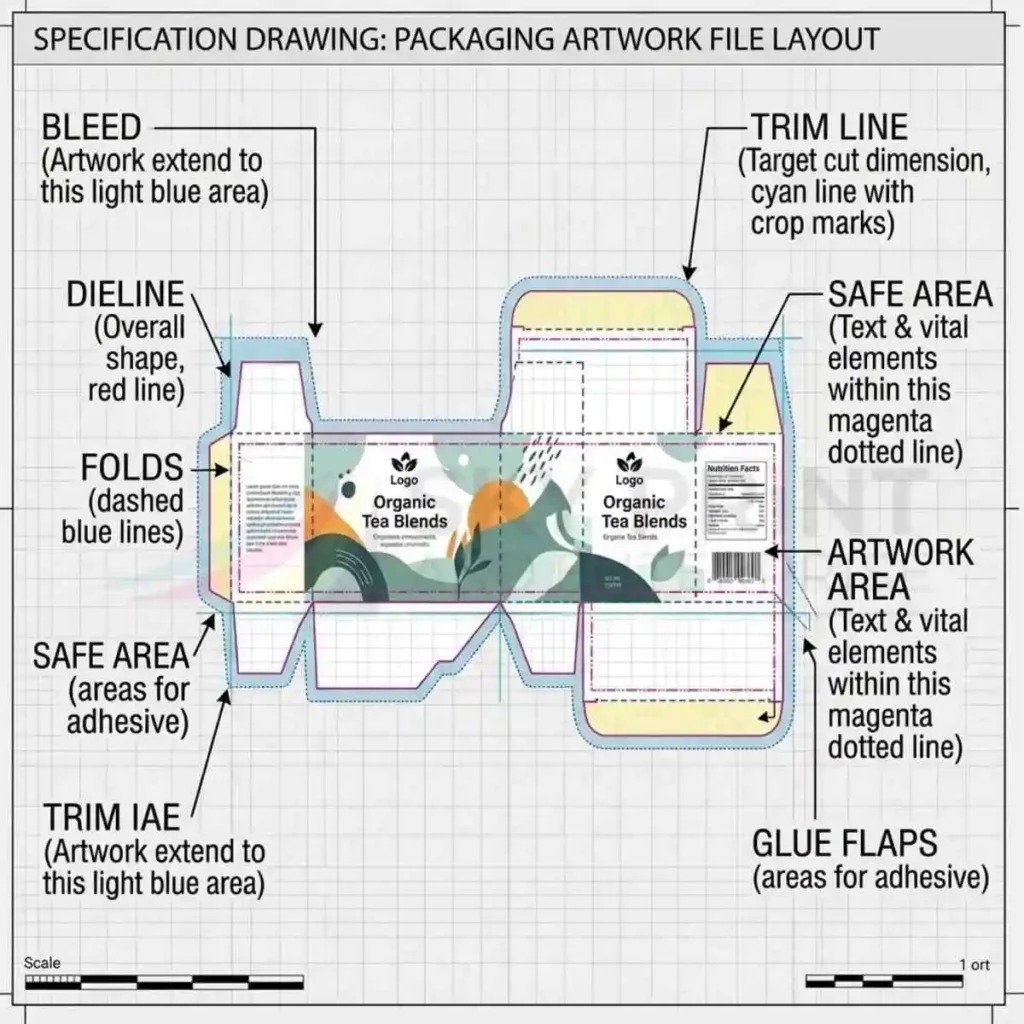
Packaging artwork includes essential technical areas such as bleed, trim, safe area, dielines, folds and glue flaps.
Packaging Artwork Guide: What Is Packaging Artwork?
Packaging artwork is the complete collection of visual elements prepared for packaging production. At Sky Print & Enterprise, this includes logos, typography, product images, colours, illustrations, barcodes, regulatory information, symbols, decorative graphics and finishing instructions. These design elements are positioned accurately on an approved packaging dieline before printing begins.
Although many people think packaging artwork is simply graphic design, professional artwork preparation for commercial printing on packaging involves much more. Designers must ensure that every element aligns correctly with the structural template, remains inside the safe area and extends into the bleed where necessary. Furthermore, colours must be prepared correctly for commercial printing, while images require sufficient resolution to reproduce sharply on the finished package.
Key Components of Professional Packaging Artwork
Consequently, professionally prepared packaging artwork ensures that the final printed box looks exactly as intended after cutting, folding and assembly. Without accurate artwork preparation, even a well-designed package may suffer from misaligned graphics, blurred images, trimming errors or production delays.
Packaging Artwork Usually Includes
- Company logo and branding.
- Product name.
- Marketing graphics.
- Product photography.
- Ingredient or specification information.
- Barcodes and QR codes.
- Legal and regulatory text.
- Colour references.
- Finishing instructions.
- Printer production notes.
Packaging Artwork Guide: Why Professional Artwork Matters
Professional packaging artwork directly influences print quality, manufacturing efficiency and customer perception. Therefore, investing time in preparing artwork correctly is just as important as selecting the right packaging material or box style.
First impressions often determine whether customers notice a product on a crowded retail shelf. Consequently, sharp graphics, consistent colours and professionally positioned branding help products appear more premium and trustworthy. Furthermore, accurate artwork reduces production errors because printers receive files that meet commercial printing standards from the beginning.
How Professional Artwork Protects Your Brand
Professional artwork also supports brand consistency. For example, businesses that use identical colours, typography and graphic layouts across every product create stronger brand recognition. Likewise, maintaining consistent artwork standards across packaging, labels and marketing materials reinforces customer confidence.
From a manufacturing perspective, professionally prepared artwork shortens prepress time, reduces revisions and minimises printing delays. As a result, production becomes faster, more efficient and more cost-effective.
Benefits of Professional Packaging Artwork
- Improves print quality.
- Strengthens brand identity.
- Reduces production errors.
- Supports faster manufacturing.
- Creates a premium customer experience.
- Minimises costly artwork revisions.
Packaging Artwork Guide: Packaging Design vs Packaging Artwork vs Packaging Dielines
These three terms are often confused. However, they describe different stages of the packaging development process. Understanding the distinction allows designers and manufacturers to communicate more efficiently throughout production.
| Element | Purpose |
|---|---|
| Packaging Design | Develops the visual concept, branding and customer appeal. |
| Packaging Artwork | Prepares production-ready graphics for commercial printing. |
| Packaging Dieline | Defines the structural layout, cut lines, folds and glue areas. |
In practice, these three disciplines work together. First, the structural engineer creates the packaging dieline. Next, the graphic designer prepares the packaging artwork using the approved template. Finally, the commercial printer produces the finished packaging using both the structural file and the artwork file. Consequently, every stage depends on the accuracy of the previous one.
If you would like to understand the engineering side of structural packaging in greater detail, read our Packaging Dieline Guide, which explains cut lines, fold lines, glue flaps and structural development from concept to production.
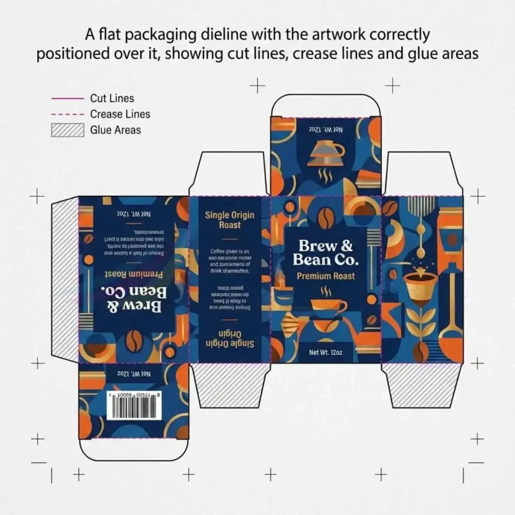
A packaging dieline shows how printed artwork is positioned around cut lines, crease lines and glue areas before production.
Coming Up Next
Next, this Packaging Artwork Guide explores print-ready artwork, vector graphics, raster images, image resolution, colour modes, file formats and the professional standards every designer should follow before sending artwork to commercial print.
Packaging Artwork Guide: What Is Print-Ready Packaging Artwork?
Designing attractive packaging is only the beginning of the production process. However, before commercial printing can begin, every design must be converted into print-ready packaging artwork. Therefore, designers should understand the technical requirements that printers expect before submitting artwork for production.
Print-ready artwork is a professionally prepared file that contains every graphic element in the correct format, colour mode and position. Furthermore, the artwork includes bleed, safe areas, crop marks, correctly embedded images and properly managed fonts. Consequently, printers can manufacture packaging accurately without requesting further amendments.
Although different printing companies may have slightly different specifications, the core principles remain consistent throughout the packaging industry. As a result, learning these standards helps businesses avoid unnecessary delays while producing consistently high-quality packaging.
Packaging Artwork Guide: Characteristics of Professional Print-Ready Artwork
Professional packaging artwork follows strict production standards because commercial printing equipment requires accurate files. Consequently, every element should be prepared before sending artwork to your packaging manufacturer.
Furthermore, printers should never need to reposition logos, replace missing fonts or adjust colours. Instead, designers should deliver artwork that is completely production-ready from the outset. Therefore, careful preparation saves time while reducing production costs.
Professional Packaging Artwork Should Include
- CMYK colour mode.
- High-resolution images.
- Correct bleed settings.
- Safe zones.
- Vector logos.
- Outlined or embedded fonts.
- Linked images included.
- Approved packaging dieline.
- Separate finishing layers.
- Print-ready PDF export.
When every requirement is satisfied, commercial printers can begin production immediately. Consequently, artwork approval becomes faster and manufacturing proceeds without unnecessary interruptions.
Packaging Artwork Guide: Vector Graphics vs Raster Images
One of the most important decisions when preparing packaging artwork involves choosing the correct graphic format. Although both vector graphics and raster images play valuable roles, each serves a different purpose during commercial printing.
Vector Graphics
Vector graphics use mathematical paths instead of pixels. Consequently, they can be enlarged indefinitely without losing quality. Therefore, logos, icons, illustrations, line drawings and typography should normally remain as vector artwork.
Furthermore, vector graphics produce exceptionally sharp edges during printing. As a result, branding appears crisp even on premium luxury packaging.
Raster Images
Raster graphics consist of pixels. Therefore, image quality depends entirely upon resolution. Product photography and detailed images generally use raster formats because they contain millions of colour variations.
However, enlarging low-resolution raster images causes pixelation and blurred printing. Consequently, designers should always use high-quality source images.
| Vector Graphics | Raster Images |
|---|---|
| Infinite scalability | Resolution dependent |
| Perfect for logos | Ideal for photographs |
| Small file size | Larger file size |
| Always sharp | Can become pixelated |
Packaging Artwork Guide: Image Resolution for Commercial Printing
Image resolution directly affects print quality. Consequently, professional packaging should always use images that reproduce clearly at their final printed size.
For commercial packaging, the industry standard is 300 dpi (dots per inch). At this resolution, photographs appear sharp, gradients remain smooth and printed details stay clear. By contrast, low-resolution images often produce blurred edges and visible pixels.
Furthermore, downloading images from websites rarely provides sufficient resolution for commercial printing because most online graphics are optimised for digital screens rather than printed packaging.
Recommended Resolution
- Packaging photography — 300 dpi.
- Product images — 300 dpi.
- Illustrations — Vector preferred.
- Logos — Vector preferred.
- Icons — Vector preferred.
Whenever possible, request original artwork from photographers or designers instead of copying images from websites or social media. Consequently, your finished packaging will reproduce significantly better.
Packaging Artwork Guide: RGB vs CMYK Colour Modes
Many new designers accidentally prepare packaging artwork using RGB colours because computer monitors display graphics digitally. However, commercial printing uses CMYK inks rather than coloured light. Therefore, artwork should normally be converted before production begins.
RGB Colour Mode
RGB combines red, green and blue light to display colours on digital screens. Consequently, colours often appear brighter than they will after printing.
CMYK Colour Mode
CMYK uses cyan, magenta, yellow and black printing inks. Therefore, commercial printing presses reproduce colours using these four process colours.
Furthermore, converting RGB artwork at the final production stage may change colour appearance unexpectedly. Consequently, designers should begin packaging artwork in CMYK whenever possible.
If precise brand colours are essential, Pantone spot colours may also be specified. We will explore colour management, Pantone matching and specialist inks later in this Packaging Artwork Guide.
PACKAGING ARTWORK
Packaging Products That Benefit From Professional Artwork
Professional packaging artwork helps ensure your branding, product information,
colours and graphics are accurately prepared for your chosen packaging format.
Custom Product Boxes
Create a professional brand presentation with carefully prepared packaging artwork,
including logos, product details, colours and graphics.
Ideal for: Retail & branded products
Custom Carton Boxes
Prepare accurate artwork for carton packaging with correctly positioned branding,
typography, product information and print specifications.
Ideal for: Consumer & retail packaging
Corrugated Boxes
Use print-ready packaging artwork to present your brand consistently across
corrugated shipping, retail and promotional boxes.
Ideal for: Shipping & eCommerce
Die-Cut Boxes
Accurate artwork is essential when working with custom die-cut structures,
ensuring graphics align properly with the approved packaging dieline.
Ideal for: Custom-shaped packaging
Food Boxes
Professional artwork can incorporate branding, product information, graphics and
required details into a clear and attractive food packaging design.
Ideal for: Food & takeaway brands
Custom Mailer Boxes
Turn every delivery into a branded experience with artwork that showcases your
logo, colours, messaging and visual identity.
Ideal for: eCommerce & subscription brands
Rigid Boxes
Premium rigid packaging benefits from precise artwork preparation that maintains
brand consistency across panels, surfaces and finishing areas.
Ideal for: Luxury & premium products
Window Boxes
Packaging artwork should account for window placement while keeping important
branding, text and graphics clearly visible on the finished box.
Ideal for: Product display packaging
Box Sleeves
Create a polished presentation with artwork designed to fit sleeve dimensions,
ensuring graphics and messaging remain aligned after production.
Ideal for: Branded product presentation
Holographic Boxes
Carefully prepared artwork helps coordinate branding and graphics with holographic
effects for a distinctive and premium packaging appearance.
Ideal for: Premium & promotional packaging
Need Packaging Artwork for Your Product?
Prepare your packaging artwork with the correct dimensions, layout and print
specifications before production begins.
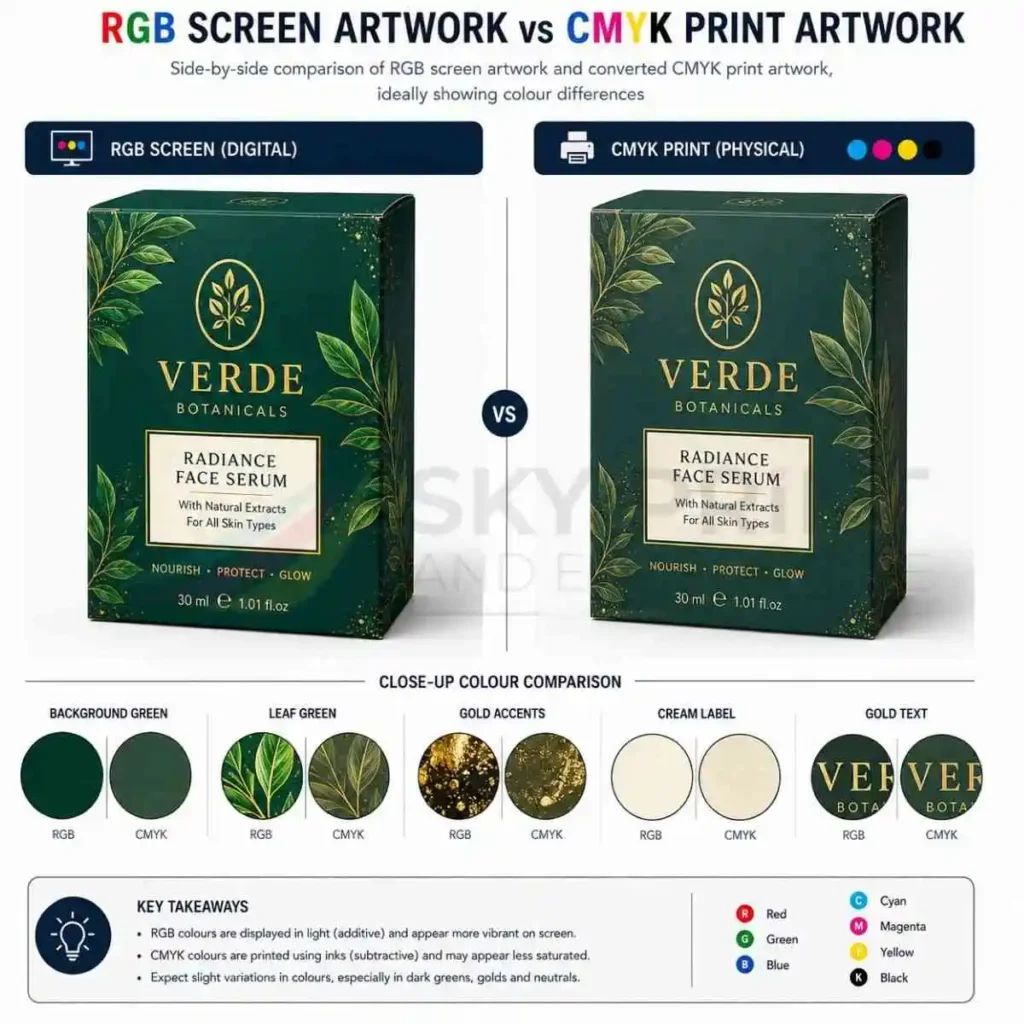
CMYK is used for professional print production, while RGB is primarily intended for digital screens.
Coming Up Next
Next, this Packaging Artwork Guide explains bleed, trim lines, safe zones, crop marks, registration marks and artwork layers. These production elements are essential for creating accurate, print-ready packaging artwork that performs perfectly during die cutting and commercial printing.
Packaging Artwork Guide: Understanding Bleed, Trim Line and Safe Zone
One of the most important topics in this Packaging Artwork Guide is understanding bleed, trim lines and safe zones. Although these production elements are rarely noticed by customers, they play a vital role during commercial printing. Consequently, every professionally prepared packaging artwork file must include them before production begins. Without these technical guides, even beautifully designed packaging can develop visible printing defects after cutting and finishing.
Commercial printing involves several manufacturing stages, including printing, die cutting, creasing, folding and gluing. During these processes, extremely small movement can occur while large sheets travel through different machines. Although modern printing presses are remarkably accurate, slight tolerances are always expected. Therefore, printers never trim packaging directly on the edge of the artwork. Instead, they rely on bleed areas and safe zones to ensure every finished package maintains a professional appearance.
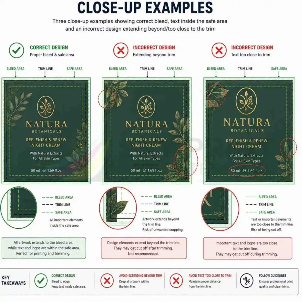
Correct bleed, trim and safe-area placement helps prevent important artwork from being cut off during packaging production.
The bleed area extends the background colour, image or graphic beyond the final cut line. Consequently, if the cutting blade shifts by a fraction of a millimetre, the printed colour still reaches the edge of the finished carton. By contrast, if no bleed is supplied, a narrow white border may appear around one or more sides of the packaging. Even though the movement may be extremely small, customers immediately notice these white edges because they make the packaging appear poorly manufactured.
Why Bleed Is Essential for Professional Printing
For most commercial packaging projects, printers recommend a bleed of approximately 3 mm on every side. However, certain luxury packaging projects, oversized cartons or specialist finishing processes may require different specifications. Therefore, designers should always follow the requirements provided by the packaging manufacturer before exporting artwork.
Equally important is the trim line. This line represents the exact position where the printed sheet will be cut during production. Although customers never see the trim line, every design decision depends upon it. Consequently, artwork should never stop at the trim line because slight manufacturing tolerances could expose unprinted paperboard. Instead, backgrounds and images should continue into the bleed area while important design elements remain safely inside the finished panel.
The safe zone protects important information from being trimmed or folded. Company logos, product names, legal text, barcodes and QR codes should always remain inside this protected area. Furthermore, maintaining generous spacing around the edges improves readability and creates a cleaner overall layout. As a result, packaging looks more professional while remaining fully functional after assembly.
Protecting Important Design Elements with Safe Zones
Many inexperienced designers place text too close to fold lines because the flat artwork appears balanced on screen. However, once the packaging is folded, the design often looks cramped or partially hidden. Therefore, experienced artwork specialists always visualise the finished three-dimensional package instead of concentrating only on the flat template.
Another advantage of using correct bleed and safe zones is faster production approval. Because printers receive technically accurate artwork, they spend less time requesting amendments or correcting files manually. Consequently, projects move through prepress more efficiently while production schedules remain on track. Businesses also save money because fewer revisions are required before printing begins.
Ultimately, bleed, trim lines and safe zones may appear to be simple technical details. Nevertheless, they have a direct influence on print quality, manufacturing efficiency and the final appearance of every custom printed package. Therefore, every designer should treat these production guides as essential components of professional packaging artwork rather than optional additions.
Packaging Artwork Guide: Crop Marks, Registration Marks and Artwork Layers
After bleed and safe zones have been prepared correctly, the next stage involves adding production marks that help commercial printers manufacture packaging accurately. Although customers never see these marks, they provide essential guidance throughout the printing and finishing process. Consequently, every professional packaging artwork file should contain the appropriate production information before being exported as a print-ready PDF.
Crop marks indicate exactly where the printed sheet should be trimmed after printing. They appear outside the bleed area and allow finishing equipment to align accurately with the packaging artwork. Furthermore, crop marks help maintain consistent dimensions throughout large production runs, ensuring that every carton matches the approved structural design. As a result, packaging assembles correctly while maintaining a professional appearance.
How Production Marks Improve Print Accuracy
Registration marks perform a different function. Modern commercial printing presses apply multiple ink colours separately before combining them into one finished image. Therefore, printers use registration marks to ensure every printing plate aligns perfectly during production. If even one colour shifts slightly, the finished graphics may appear blurred or produce unwanted coloured outlines around text and images. Consequently, accurate registration is essential for premium packaging.
Professional artwork also relies on organised artwork layers. Rather than placing every design element on a single layer, experienced designers separate production information according to its purpose. For example, cut lines, crease lines, glue areas, varnish, foil stamping, embossing and white ink should each occupy their own clearly labelled layer. This organisation makes artwork easier to review while allowing prepress operators to isolate individual production processes quickly.
Furthermore, organised layers reduce the likelihood of manufacturing errors. If a foil layer is accidentally merged with the main artwork, production problems can occur. Likewise, placing cut lines on the wrong layer may confuse automated prepress software. Therefore, maintaining a logical layer structure improves both efficiency and accuracy throughout the production workflow.
Organising Artwork Layers for Commercial Printing
Another important consideration is layer naming. Generic names such as “Layer 1” or “Copy” provide very little information. Instead, descriptive titles such as “Cut Line”, “Emboss”, “Spot UV”, “White Ink” or “Glue Area” allow everyone involved in the project to understand the artwork immediately. Consequently, communication between designers, printers and packaging manufacturers becomes much more efficient.
Before approving any packaging artwork, designers should perform a thorough production check. First, confirm that crop marks remain outside the bleed area. Next, ensure registration marks have not been deleted accidentally. Afterwards, review every artwork layer individually to confirm that specialist finishes appear only where intended. Finally, export a press-ready PDF and inspect the finished file carefully before sending it to the printer.
If you are preparing artwork using an approved structural template, it is also advisable to compare your file with the original packaging dieline. This final comparison helps confirm that graphics align correctly with fold lines, locking tabs and glue flaps. For a complete explanation of structural templates and engineering drawings, you can also read our Packaging Dieline Guide, which explains how artwork and dielines work together during commercial packaging production.
Final Checks Before Exporting Artwork
Although production marks and artwork layers remain invisible after manufacturing, they are fundamental to successful commercial printing. Therefore, investing time in organising artwork correctly not only improves print quality but also reduces production delays, prevents costly mistakes and ensures that every package reaches customers exactly as intended.
Packaging Artwork Guide: Fonts, Typography and Readability
Typography is one of the most overlooked aspects of packaging artwork, yet it has a significant influence on both product presentation and customer experience. Throughout this Packaging Artwork Guide, we have focused on preparing technically accurate files. However, excellent technical preparation alone cannot compensate for poor typography. Therefore, every packaging designer should understand how fonts, spacing and text hierarchy affect commercial printing.
The primary purpose of packaging typography is communication. Customers should immediately recognise the product name, understand the product description and locate essential information without difficulty. Consequently, every font choice should improve readability rather than simply add decoration. Although highly decorative fonts may look attractive on screen, they often become difficult to read once printed on smaller packaging panels.
Choosing Fonts for Packaging
Professional packaging normally combines two or three complementary typefaces rather than using numerous unrelated fonts. For example, a bold sans-serif font may be used for the product name, while a clean serif or modern sans-serif font works well for supporting information. As a result, the packaging develops a clear visual hierarchy that guides customers naturally across each panel.
Font size also deserves careful attention. Small legal information, ingredients and warning text must remain readable after printing. Furthermore, luxury finishes such as foil stamping and embossing may reduce the clarity of very small characters. Therefore, designers should always consider the final production method before selecting font sizes.
Another important consideration involves letter spacing and line spacing. Text placed too closely together often appears crowded after printing, particularly on textured boards or uncoated materials. Conversely, generous spacing improves legibility while creating a cleaner premium appearance. Consequently, professional packaging usually feels more organised and easier to read.
Typography Best Practices for Print
Before exporting artwork, designers should convert fonts into outlines whenever the printer requests this format. Doing so prevents font substitution if the receiving computer does not contain the original typeface. Likewise, outlining fonts preserves the exact appearance of every character, ensuring that logos and brand names reproduce consistently throughout production.
Businesses should also maintain consistent typography across every product within the same range. Using identical fonts on cartons, labels, sleeves, leaflets and promotional material strengthens brand recognition while creating a cohesive identity. As a result, customers quickly recognise products regardless of their size or packaging format.
Finally, remember that typography should complement the packaging structure. Avoid placing text over fold lines, glue flaps or locking tabs because these areas may distort important information after assembly. Instead, position critical content comfortably within the safe zone where it remains fully visible. Consequently, customers enjoy a better reading experience while the finished packaging appears more refined and professionally produced.
Packaging Artwork Guide: Barcodes, QR Codes and Regulatory Information
Every commercial packaging project contains more than attractive branding and product photography. In most industries, packaging must also include functional information that supports retail sales, logistics and legal compliance. Consequently, designers should allocate sufficient space for barcodes, QR codes and mandatory product information during the earliest stages of artwork preparation.
A barcode is one of the most important elements on retail packaging because it enables efficient stock management and product identification. However, simply placing a barcode onto the artwork is not enough. The barcode must remain sharp, high contrast and free from distortion. Furthermore, sufficient clear space should surround the barcode to ensure scanners can read it accurately. Therefore, avoid positioning graphics, fold lines or decorative elements too close to this area.
Positioning Barcodes and QR Codes Correctly
QR codes have also become increasingly popular because they connect printed packaging with digital experiences. For example, businesses frequently use QR codes to direct customers towards instruction manuals, promotional videos, authentication pages, loyalty programmes or product registration forms. Consequently, packaging becomes an interactive marketing tool rather than merely a protective container.
Nevertheless, QR codes require the same level of care as barcodes. They should remain large enough for reliable scanning and should never cross folds, cut lines or curved surfaces where distortion could occur. Additionally, always test QR codes after exporting the final print-ready PDF rather than assuming they will function correctly.
Regulatory information is equally important, particularly within food, cosmetic, pharmaceutical and chemical industries. Depending on the product, packaging may need to display ingredients, nutritional values, allergens, storage instructions, safety warnings, recycling symbols, country of origin, manufacturing details and batch information. Therefore, designers should leave adequate space for this content before finalising the artwork layout.
Planning Space for Regulatory Information
Many businesses underestimate how much room regulatory text requires. Consequently, they attempt to reduce font sizes at the final stage, making important information difficult to read. Instead, plan the layout carefully from the beginning so legal information integrates naturally into the overall design without compromising readability.
Another best practice involves grouping related information together. Place nutritional information in one panel, legal details in another and barcode information in a clearly defined area. As a result, consumers locate information quickly while the packaging maintains a clean and organised appearance.
Before approving artwork, print a full-size proof on paper and review every panel carefully. Scan the barcode, test every QR code and check that mandatory information remains legible. Furthermore, compare the proof with the approved packaging dieline to ensure no essential information extends into glue flaps or fold lines. This simple verification process often prevents expensive production errors and unnecessary delays.
Final Compliance Checks Before Printing
Ultimately, successful packaging artwork combines attractive branding with accurate technical information. When typography, barcodes, QR codes and regulatory content work together effectively, the finished package not only attracts customers but also performs efficiently throughout retail distribution and commercial printing.
Packaging Artwork Guide: CMYK, Pantone Colours and Colour Accuracy
Colour consistency is one of the most important factors in professional packaging production. Customers often recognise a brand by its colours before they read the product name. Therefore, maintaining accurate colour reproduction throughout every print run is essential for brand recognition and customer confidence. Throughout this Packaging Artwork Guide, we have discussed technical artwork preparation. However, colour management deserves its own attention because even perfectly designed artwork can appear inconsistent if colours are prepared incorrectly.
Most commercial packaging is printed using the CMYK process, which combines cyan, magenta, yellow and black inks to reproduce thousands of different colours. Consequently, CMYK offers an economical solution for packaging that contains photographs, gradients and multiple colours. Furthermore, digital and offset printing presses are designed to reproduce CMYK artwork efficiently, making it the preferred option for many commercial packaging projects.
Understanding CMYK and Pantone Printing
Nevertheless, some brands require colours that remain identical across every production batch. Luxury retailers, cosmetic companies and international brands often specify exact corporate colours that cannot vary between print runs. In these situations, Pantone Matching System (PMS) colours provide a more accurate solution. Instead of mixing four process inks during printing, Pantone colours use specially manufactured inks that reproduce the same shade consistently on different materials and printing presses.
For example, a company’s logo may appear on folding cartons, rigid gift boxes, paper bags, labels and marketing literature. If each product uses slightly different shades of blue or green, the brand begins to lose consistency. Therefore, specifying Pantone colours allows every printed item to match more accurately, regardless of where it is produced.
Material selection also influences colour appearance. Colours printed on coated paperboard usually appear brighter because the ink remains close to the surface. By contrast, uncoated or kraft materials absorb more ink, producing softer and slightly darker colours. Consequently, designers should review printed proofs on the actual packaging material whenever colour accuracy is particularly important.
How Different Materials Affect Colour
Lighting conditions create another challenge. Artwork viewed on an uncalibrated computer monitor rarely matches the final printed result because screens produce colour using light rather than ink. Therefore, professional designers often calibrate their monitors and request printed proofs before approving production. This additional step helps identify colour differences while changes remain inexpensive.
Furthermore, avoid mixing RGB graphics with CMYK artwork during the final production stage. Although RGB colours may appear vibrant on screen, they often lose brightness after conversion for commercial printing. Instead, prepare artwork in CMYK from the beginning whenever possible. As a result, colour expectations remain realistic throughout the design process.
Ultimately, effective colour management combines technical knowledge with careful planning. Whether your packaging uses standard CMYK printing or specialist Pantone inks, accurate colour preparation ensures your finished packaging represents your brand professionally while maintaining consistency across every product range.
Packaging Artwork Guide: Preparing Artwork for Foil, Spot UV, Embossing and White Ink
Premium packaging frequently includes decorative finishes that enhance visual appeal and create a memorable customer experience. However, these finishes require additional artwork preparation beyond standard CMYK printing. Therefore, designers should understand how specialist finishing processes are incorporated into commercial production before finalising artwork files.
Foil stamping remains one of the most popular luxury finishes because it adds metallic highlights that immediately attract attention. Gold, silver, copper and holographic foils are commonly used on cosmetic packaging, premium gift boxes, jewellery packaging and high-end retail products. Nevertheless, foil artwork should never be merged with the main design layer. Instead, create a separate vector layer that clearly identifies every area receiving foil. Consequently, the printer can manufacture the foil die accurately without affecting the remaining artwork.
Creating Separate Layers for Luxury Finishes
Spot UV follows a similar principle. Rather than covering the entire package with varnish, Spot UV highlights selected areas such as logos, product names or decorative patterns. As a result, the contrast between glossy and matt surfaces creates a sophisticated premium finish. Furthermore, using Spot UV selectively prevents the packaging from appearing overcrowded while directing attention towards important branding elements.
Embossing and debossing introduce texture by raising or recessing selected parts of the packaging. These finishes work particularly well on logos, monograms and luxury branding because they create a tactile experience as well as a visual one. However, embossed elements require sufficient spacing from fold lines and cut edges. Otherwise, structural pressure during folding may reduce the quality of the finished effect.
White ink has also become increasingly important, particularly when printing on transparent films, coloured boards or kraft materials. Without white ink, many colours lose their brightness because the substrate influences the final appearance. Consequently, designers frequently create a dedicated white ink layer beneath selected graphics before printing begins.
Preparing Artwork for Premium Print Effects
When preparing artwork for multiple finishes, organisation becomes essential. Each finishing process should occupy its own clearly labelled layer using solid vector shapes rather than raster images. For example, one layer may define foil stamping, another Spot UV and another white ink. This structure allows prepress operators to separate production processes quickly while reducing the possibility of manufacturing errors.
Before approving artwork, request a production proof whenever specialist finishes are involved. Although digital previews provide a useful indication, they cannot accurately reproduce the appearance of metallic foils, textured embossing or gloss varnishes. Therefore, a printed sample remains the most reliable method of evaluating premium packaging before full production.
Finally, remember that luxury finishes should enhance the packaging rather than dominate it. Applying too many decorative effects can distract from the product itself and increase manufacturing costs unnecessarily. Instead, select finishes that support your brand identity and complement the overall packaging design. Consequently, the finished package appears elegant, balanced and professionally manufactured while maintaining strong commercial appeal.
Packaging Artwork Guide: Preparing Artwork for Different Types of Packaging
Every packaging format requires a slightly different approach during artwork preparation. At Sky Print and Enterprise, the fundamental principles remain consistent, but panel sizes, structural layouts, printing methods and finishing options vary considerably between packaging styles. Therefore, designers should never assume that artwork prepared for one product can simply be copied to another. Instead, every packaging project should begin with an approved structural template and a clear understanding of how the finished package will be manufactured.
Folding cartons are among the most common forms of retail packaging because they offer excellent print quality while remaining economical for medium and large production runs. Consequently, artwork for folding cartons should align accurately with every fold line, locking tab and glue flap. Designers should also avoid placing important text across panel joins because folding can interrupt readability. Furthermore, backgrounds and images should extend fully into the bleed area so that trimming produces clean edges without visible white borders.
Artwork for Folding Cartons and Rigid Boxes
Rigid boxes require a different approach because the printed paper wrap is mounted onto thick greyboard after printing. Therefore, artwork must include additional wrapping margins that allow the printed sheet to fold neatly around the edges of the board. Logos positioned too close to these wrapping areas may become distorted once the box is assembled. Consequently, careful planning is essential when designing premium rigid packaging.
Corrugated packaging introduces further considerations. Unlike folding cartons, corrugated board contains fluting that influences print quality. Large solid colours generally reproduce well, whereas extremely fine typography may appear less sharp because of the textured surface. Designers should therefore use bold typography, generous spacing and clear graphics that remain effective on corrugated materials.
Sleeves and belly bands also require accurate artwork positioning because they wrap around an existing product or box. Consequently, the front panel should display the primary branding while the overlap area remains free from important design elements. Likewise, barcode placement should avoid glued joints whenever possible.
Artwork Considerations for Labels and Bags
Paper bags present another unique challenge. Designers should consider rope handles, folded tops and reinforced base panels before positioning artwork. Otherwise, important branding may disappear beneath handles or structural folds after manufacturing. Therefore, obtaining the manufacturer’s artwork template before beginning the design saves considerable time during production.
Labels and stickers appear simple compared with cartons, yet they also require careful preparation. Curved containers, bottles and jars distort graphics when labels wrap around them. As a result, designers often create mock-ups to ensure logos and text remain visually balanced after application.
Regardless of the packaging style, one principle always remains true. The artwork should complement the structural design rather than compete with it. When designers understand how each package is assembled, they create layouts that look attractive both as flat artwork and as finished three-dimensional packaging. Consequently, the customer receives a premium product that communicates quality before it is even opened.
Packaging Artwork Guide: Artwork Proofing, Prepress and Final Approval
After the artwork has been completed, the project enters one of the most important stages of commercial printing: proofing and prepress. Many production problems occur because businesses approve artwork too quickly without performing a structured review. Therefore, every packaging project should include a thorough proofing process before manufacturing begins. Spending a little extra time at this stage can prevent expensive mistakes later.
The first step involves checking the artwork visually. Designers should zoom into the file and inspect every panel individually. Product names, ingredient lists, legal information, contact details, barcodes and QR codes should all be reviewed carefully. Furthermore, spelling, grammar and punctuation deserve just as much attention as the visual design because correcting text after printing is both expensive and time-consuming.
Checking Artwork Before Approval
Next, compare the artwork with the approved packaging dieline. Every logo, photograph and block of text should sit comfortably within the safe zone while respecting fold lines and glue flaps. In addition, verify that backgrounds extend correctly into the bleed area and that specialist finishes such as foil stamping or Spot UV appear only on their designated layers.
Colour checking forms another essential part of the approval process. Whenever colour consistency is critical, request either a calibrated digital proof or a printed contract proof from the manufacturer. Although computer monitors provide a useful preview, they cannot reproduce printed colours with complete accuracy. Consequently, reviewing a physical proof often highlights small differences before production begins.
Once the artwork has been approved, prepress technicians prepare the files for commercial printing. During this stage, they confirm image resolution, font handling, colour separation, trapping, overprint settings and print compatibility. Furthermore, they verify that the artwork matches the production specifications supplied by the structural design team. If any technical issue is discovered, the file returns for correction before printing starts.
The Role of Prepress in Commercial Printing
Professional packaging manufacturers also perform a preflight inspection using specialised software. This automated process identifies missing fonts, low-resolution images, incorrect colour modes, damaged files and other production risks. As a result, many problems are identified before they reach the printing press, saving both time and material costs.
Before giving final approval, print the artwork at full size whenever possible. Fold a paper mock-up using the packaging dieline and examine the finished structure from every angle. This simple exercise often reveals alignment problems that remain invisible on a computer screen. Furthermore, scan every barcode and QR code, confirm legal information and ensure branding appears correctly on the principal display panel.
Finally, maintain clear communication with your packaging supplier throughout the approval process. If you are uncertain about bleed, colour management, finishing layers or production tolerances, ask for clarification before signing off the artwork. Experienced manufacturers prefer answering questions early rather than correcting avoidable mistakes after production has started. Consequently, collaboration between designers, printers and structural engineers produces better packaging, shorter production times and consistently higher print quality.
Professional Artwork Approval Checklist
- ✓ Artwork matches the approved packaging dieline.
- ✓ Images are 300 dpi at final print size.
- ✓ Colours are prepared in CMYK or Pantone where required.
- ✓ Fonts are outlined or correctly embedded.
- ✓ Bleed and safe zones have been checked.
- ✓ Barcodes and QR codes have been tested.
- ✓ Specialist finishes are on separate layers.
- ✓ Print-ready PDF has been reviewed before submission.
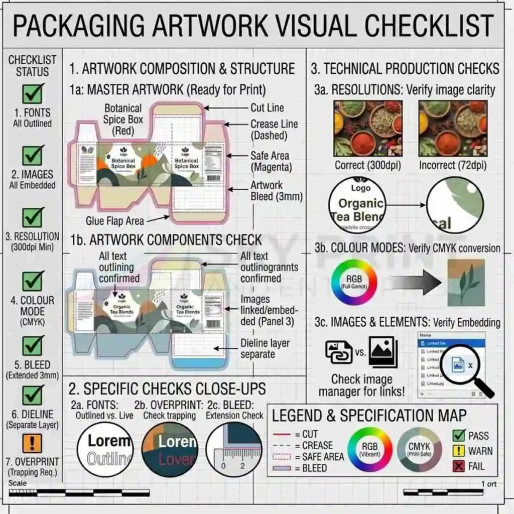
A packaging artwork preflight checks fonts, image resolution, colour mode, bleed, dielines and other production requirements before printing.
Packaging Artwork Guide: Common Artwork Mistakes and How to Avoid Them
Even experienced designers occasionally make mistakes when preparing packaging artwork. However, the difference between a successful production run and an expensive reprint often depends on whether those mistakes are identified before the files reach the printing press. Therefore, understanding the most common artwork errors can save both time and money while improving the overall quality of the finished packaging. Throughout this Packaging Artwork Guide, we have explored professional artwork preparation. Now, it is equally important to understand the problems that frequently occur during commercial packaging projects.
One of the most common mistakes involves using low-resolution images. Although a photograph may appear sharp on a computer screen, it often becomes blurry or pixelated when printed on packaging. Consequently, always use original high-resolution images at 300 dpi for commercial printing. Furthermore, avoid downloading graphics from websites because online images are usually optimised for digital viewing rather than professional print production.
Another frequent problem is incorrect colour mode. Designers sometimes create artwork in RGB because monitors display colours more vividly in that format. However, commercial printing uses CMYK or Pantone inks. Therefore, converting colours at the final stage can produce noticeable differences between the screen and the finished packaging. To avoid disappointment, prepare artwork in the correct colour mode from the beginning of the project.
Technical Mistakes That Delay Production
Missing bleed is another expensive mistake. If backgrounds end exactly at the trim line instead of extending into the bleed area, even slight movement during die cutting can create visible white edges. Consequently, every background colour, image and graphic should extend beyond the trim line according to the printer’s specifications.
Designers also place important information too close to fold lines or cut edges. Product names, logos, barcodes and legal text should always remain inside the safe zone because folding or trimming may reduce readability. Likewise, decorative borders positioned too close to the edge often appear uneven after production because manufacturing tolerances vary slightly throughout every print run.
Another issue involves failing to outline fonts or embed them correctly. If the printer does not have the original font installed, the software may substitute another typeface automatically. As a result, the finished packaging no longer matches the approved design. Therefore, convert fonts to outlines whenever possible before exporting the final artwork.
Design Mistakes That Affect Print Quality
Businesses also underestimate the importance of proofreading. Small spelling mistakes, incorrect product information or outdated contact details often remain unnoticed until thousands of cartons have already been printed. Consequently, every packaging project should undergo several independent proofreading stages before final approval.
Finally, many projects suffer because designers begin creating artwork before receiving the approved packaging dieline. This approach almost always leads to unnecessary revisions because graphics rarely align perfectly with the final structural design. Instead, always begin artwork using the manufacturer’s approved dieline template. As a result, the design process becomes more efficient while production delays are significantly reduced.
How to Prevent Artwork Errors
Ultimately, avoiding these common mistakes requires careful planning rather than complicated technical knowledge. When designers follow professional workflows and review every file systematically, packaging production becomes faster, more economical and consistently more reliable.
Packaging Artwork Guide: Professional Artwork Workflow from Concept to Production
Professional packaging artwork does not begin with graphic design software. Instead, it starts with a structured workflow that ensures every stage of development supports the next. Consequently, successful packaging manufacturers follow a proven sequence that reduces production errors while improving efficiency. Businesses that understand this workflow communicate more effectively with designers and printers, resulting in smoother projects and higher-quality packaging.
The first stage is understanding the product itself. Designers need accurate information about the product dimensions, weight, target audience, retail environment and branding objectives. Furthermore, they should know which packaging material and box style will be used because these decisions influence both structural design and artwork preparation.
Planning the Packaging Project
Next, the structural engineering team develops the packaging dieline. This flat template determines panel sizes, fold lines, glue flaps and locking mechanisms. Only after the dieline has been approved should graphic designers begin placing artwork. Consequently, the finished graphics align perfectly with the final packaging structure.
During the creative stage, designers develop the visual identity of the packaging by selecting colours, typography, imagery and branding elements. At the same time, they allocate space for mandatory information such as ingredients, safety instructions, recycling symbols, barcodes and QR codes. Therefore, the artwork remains both visually appealing and legally compliant.
After the creative design has been approved, the artwork moves into technical preparation. Images are checked for resolution, colours are verified, fonts are outlined and bleed settings are reviewed. In addition, specialist finishing layers for foil stamping, embossing, Spot UV or white ink are prepared separately. Consequently, the prepress department receives artwork that is organised and production-ready.
From Design to Commercial Printing
The next stage involves proofing. Designers, clients and printers review digital proofs before approving the files. Whenever colour accuracy is particularly important, printed proofs are also produced for evaluation. Furthermore, paper mock-ups are sometimes assembled to confirm that graphics appear correctly after folding. These checks help identify issues before full production begins.
Once approval has been received, the artwork enters the prepress department. Here, specialised software performs automated preflight checks to identify technical problems such as missing fonts, damaged links, incorrect colour spaces or low-resolution images. If necessary, corrections are made before printing plates or digital press files are generated.
Commercial printing then begins according to the approved specifications. Following printing, the sheets move through die cutting, creasing, folding, gluing, quality inspection and packing. Finally, finished packaging is prepared for delivery to the customer.
Although this workflow may appear extensive, every stage exists for a reason. Each review reduces the possibility of production errors while improving manufacturing efficiency. Consequently, businesses receive packaging that reflects their brand accurately and performs consistently throughout distribution and retail display.
Professional Packaging Artwork Workflow
- Product research and planning.
- Packaging dieline creation.
- Graphic design development.
- Artwork preparation.
- Technical artwork review.
- Proofreading and client approval.
- Prepress inspection.
- Commercial printing.
- Die cutting and finishing.
- Quality control and delivery.
If every stage is completed carefully, the result is professionally manufactured packaging that combines outstanding visual appeal with technical precision. Therefore, following a structured artwork workflow remains one of the most effective ways to improve print quality, reduce production costs and achieve consistent packaging across every product line.
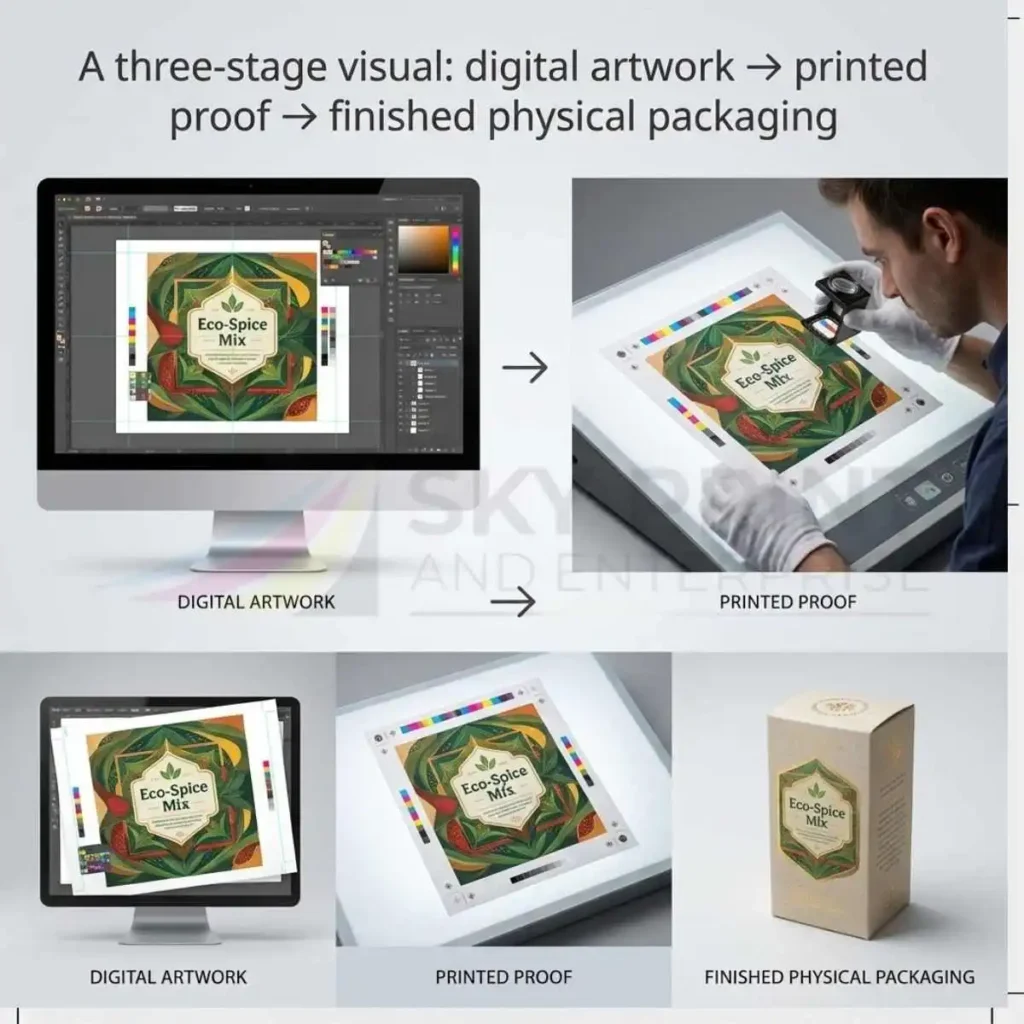
Packaging artwork moves from digital design to proofing and finally to the finished printed box.
Packaging Artwork Guide: Industry-Specific Artwork Requirements
Every industry has unique packaging requirements, which means artwork should always be developed with the final application in mind. Although the basic principles of print-ready artwork remain consistent, product information, legal regulations, branding expectations and customer behaviour differ significantly between industries. Therefore, professional packaging artwork should never follow a generic approach. Instead, designers should adapt every layout to suit the product, the market and the intended customer experience.
Food packaging is one of the most regulated sectors. Consequently, artwork must include ingredient lists, nutritional values, allergen declarations, storage instructions, cooking guidance where applicable and recycling information. Furthermore, expiry dates, batch numbers and barcode placement should be considered before finalising the layout. Designers should also leave sufficient white space around mandatory information because crowded text reduces readability and may create compliance issues. As a result, customers can quickly locate essential product information while retailers meet legal requirements.
Artwork for Food, Cosmetic and Pharmaceutical Packaging
Cosmetic packaging requires a different design strategy because purchasing decisions often depend on visual presentation. Premium typography, carefully balanced layouts and luxury finishes help communicate quality before customers even open the product. However, cosmetic artwork must also include ingredient information, usage instructions, safety warnings, product volume and manufacturer details. Therefore, successful cosmetic packaging combines elegant branding with clear regulatory information without making the design appear cluttered.
Pharmaceutical packaging demands exceptional accuracy because patient safety depends upon correct information. Consequently, artwork should prioritise readability above decorative design. Dosage instructions, warnings, active ingredients, expiry dates and serial numbers must remain highly visible. Furthermore, quality control procedures are generally stricter than those used for standard retail packaging. Designers should therefore work closely with manufacturers throughout the approval process to minimise risk.
Retail packaging often focuses on attracting attention within highly competitive environments. Consequently, bold branding, vibrant colours and clear product photography frequently play a central role. Nevertheless, retail packaging should remain practical as well as attractive. Product names should be visible from a distance, while key selling points should appear on the principal display panel. In addition, barcodes, pricing labels and retailer requirements should all be considered during artwork preparation.
Artwork for Retail, E-commerce and Luxury Packaging
E-commerce packaging introduces another set of priorities. Because brands deliver products directly to consumers rather than displaying them on shop shelves, designers should use artwork that enhances the unboxing experience while maintaining excellent durability.
Consequently, businesses often include welcome messages, QR codes linking to online support, social media information and personalised branding inside the packaging. As a result, the box itself becomes part of the overall customer experience instead of functioning solely as protective packaging.
Luxury packaging deserves special attention because every design decision contributes to the perceived value of the product. Minimalist layouts, premium typography, foil stamping, embossing and carefully controlled colour palettes often create stronger results than overly complex graphics. Therefore, designers should focus on refinement rather than excessive decoration. When luxury finishes are combined with professionally prepared artwork, the finished packaging communicates quality, exclusivity and craftsmanship from the very first impression.
Ultimately, every industry benefits from artwork that reflects both technical requirements and customer expectations. Consequently, understanding the product category before beginning the design process leads to packaging that not only prints correctly but also performs successfully in the marketplace.
Packaging Artwork Guide: Future Trends in Packaging Artwork and Commercial Printing
The packaging industry continues to evolve as technology, consumer expectations and sustainability initiatives reshape the way products are designed and manufactured. Consequently, packaging artwork is becoming more intelligent, more personalised and increasingly integrated with digital technology. Businesses that understand these developments can prepare artwork that remains effective not only today but also in the years ahead.
One of the most significant trends is variable data printing. Instead of producing thousands of identical packages, digital printing technology allows every package to contain unique information. Product serial numbers, personalised customer names, promotional codes and regional marketing messages can all change automatically during production. Consequently, brands can create more engaging customer experiences without slowing down manufacturing.
Digital Innovation in Packaging Artwork
Artificial intelligence is also beginning to influence packaging artwork development. Modern design software can suggest layouts, optimise typography, recommend colour combinations and even identify potential production issues before designers submit files for printing.
Although experienced designers remain essential, AI tools are helping to reduce repetitive tasks while improving efficiency throughout the creative process.
Another growing trend involves connected packaging. QR codes, NFC chips and augmented reality experiences are increasingly being incorporated into packaging artwork. Rather than simply displaying product information, packaging can now direct customers to instructional videos, product authentication systems, loyalty programmes or interactive marketing campaigns. Consequently, packaging becomes a communication platform instead of functioning only as a protective container.
Sustainability will continue to influence artwork decisions as well. Many brands are reducing unnecessary ink coverage, simplifying graphic layouts and replacing plastic labels with directly printed information. Furthermore, environmentally responsible messaging is becoming more prominent on packaging because consumers increasingly want to understand how products should be recycled or disposed of responsibly. Designers therefore need to balance attractive branding with clear environmental communication.
Sustainable and Smart Packaging Technologies
Advances in commercial printing technology are also improving production quality. Modern presses reproduce finer details, smoother gradients and more consistent colours than ever before. At the same time, automated quality control systems monitor colour accuracy throughout the print run, reducing waste while maintaining consistent standards. Consequently, businesses receive packaging that matches approved proofs more closely than in previous years.
Cloud-based collaboration has transformed artwork approval procedures. Designers, marketing teams and packaging manufacturers can now review the same artwork simultaneously from different locations. Comments, revisions and approvals are recorded digitally, making project management considerably more efficient. As a result, businesses shorten development times while reducing communication errors.
Although technology continues to evolve, the foundations of excellent packaging artwork remain unchanged. Accurate structural planning, high-quality images, organised artwork files, correct colour management and thorough proofing will always determine the success of a commercial packaging project. Therefore, businesses should embrace new technologies while continuing to follow the professional principles explained throughout this Packaging Artwork Guide.
Sustainable and Smart Packaging Technologies
Looking ahead, brands that combine creative design, technical precision and sustainable thinking can produce packaging that attracts customers, supports efficient manufacturing and strengthens long-term brand recognition.
Consequently, investing in professional artwork preparation will remain one of the most valuable decisions any business can make before commercial printing begins.
Packaging Artwork Guide: Industry-Specific Artwork Requirements
Every industry has unique packaging requirements, so designers should always develop artwork with the final application in mind. Although the basic principles of print-ready artwork remain consistent, product information, legal regulations, branding expectations and customer behaviour differ significantly between industries. Therefore, professional packaging artwork should never follow a generic approach. Instead, designers should adapt every layout to suit the product, the market and the intended customer experience.
Artwork Requirements for Food, Cosmetic and Pharmaceutical Packaging
Food packaging is one of the most regulated sectors. Consequently, artwork must include ingredient lists, nutritional values, allergen declarations, storage instructions, cooking guidance where applicable and recycling information. Furthermore, designers should consider expiry dates, batch numbers and barcode placement before finalising the layout. Designers should also leave sufficient white space around mandatory information because crowded text reduces readability and may create compliance issues. As a result, customers can quickly locate essential product information while retailers meet legal requirements.
Cosmetic packaging requires a different design strategy because purchasing decisions often depend on visual presentation. Premium typography, carefully balanced layouts and luxury finishes help communicate quality before customers even open the product. However, cosmetic artwork must also include ingredient information, usage instructions, safety warnings, product volume and manufacturer details. Therefore, successful cosmetic packaging combines elegant branding with clear regulatory information without making the design appear cluttered.
Pharmaceutical packaging demands exceptional accuracy because patient safety depends upon correct information. Consequently, artwork should prioritise readability above decorative design. Dosage instructions, warnings, active ingredients, expiry dates and serial numbers must remain highly visible. Furthermore, quality control procedures are generally stricter than those used for standard retail packaging. Designers should therefore work closely with manufacturers throughout the approval process to minimise risk.
Artwork for Retail, E-commerce and Consumer Products
Retail packaging often focuses on attracting attention within highly competitive environments. Consequently, bold branding, vibrant colours and clear product photography frequently play a central role. Nevertheless, retail packaging should remain practical as well as attractive. Product names should be visible from a distance, while key selling points should appear on the principal display panel. In addition, designers should consider barcodes, pricing labels and retailer requirements during artwork preparation.
E-commerce packaging introduces another set of priorities. Because brands deliver products directly to consumers rather than displaying them on shop shelves, designers should create artwork that enhances the unboxing experience while supporting excellent durability.
Consequently, businesses often include welcome messages, QR codes linking to online support, social media information and personalised branding inside the packaging. As a result, the box itself becomes part of the overall customer experience instead of functioning solely as protective packaging.
Luxury Packaging Artwork and Industry Best Practices
Luxury packaging deserves special attention because every design decision contributes to the perceived value of the product. Minimalist layouts, premium typography, foil stamping, embossing and carefully controlled colour palettes often create stronger results than overly complex graphics. Therefore, designers should focus on refinement rather than excessive decoration. Professionally prepared artwork combined with luxury finishes communicates quality, exclusivity and craftsmanship from the very first impression.
Ultimately, every industry benefits from artwork that reflects both technical requirements and customer expectations. Consequently, understanding the product category before beginning the design process leads to packaging that not only prints correctly but also performs successfully in the marketplace.
Packaging Artwork Guide: Future Trends in Packaging Artwork and Commercial Printing
The packaging industry continues to evolve as technology, consumer expectations and sustainability initiatives reshape how brands design and manufacture products. Consequently, packaging artwork is becoming more intelligent, more personalised and increasingly integrated with digital technology. Businesses that understand these developments can prepare artwork that remains effective not only today but also in the years ahead.
Digital Printing, AI and Variable Data Printing
One of the most significant trends is variable data printing. Instead of producing thousands of identical packages, digital printing technology allows every package to contain unique information. Product serial numbers, personalised customer names, promotional codes and regional marketing messages can all change automatically during production. Consequently, brands can create more engaging customer experiences without slowing down manufacturing.
Artificial intelligence is also beginning to influence packaging artwork development. Modern design software can suggest layouts, optimise typography, recommend colour combinations and even identify potential production issues before designers submit files for printing.
Although experienced designers remain essential, AI tools are helping to reduce repetitive tasks while improving efficiency throughout the creative process.
Another growing trend involves connected packaging. QR codes, NFC chips and augmented reality experiences are increasingly being incorporated into packaging artwork. Rather than simply displaying product information, packaging can now direct customers to instructional videos, product authentication systems, loyalty programmes or interactive marketing campaigns. Consequently, packaging becomes a communication platform instead of functioning only as a protective container.
Smart Packaging, QR Codes and Sustainable Artwork
Sustainability will continue to influence artwork decisions as well. Many brands are reducing unnecessary ink coverage, simplifying graphic layouts and replacing plastic labels with directly printed information. Furthermore, brands increasingly use environmentally responsible messaging on packaging because consumers want to understand how to recycle or dispose of products responsibly. Designers therefore need to balance attractive branding with clear environmental communication.
Advances in commercial printing technology are also improving production quality. Modern presses reproduce finer details, smoother gradients and more consistent colours than ever before. At the same time, automated quality control systems monitor colour accuracy throughout the print run, reducing waste while maintaining consistent standards. Consequently, businesses receive packaging that matches approved proofs more closely than in previous years.
Cloud-based collaboration has transformed artwork approval procedures. Designers, marketing teams and packaging manufacturers can now review the same artwork simultaneously from different locations. Digital tools record comments, revisions and approvals, making project management considerably more efficient. As a result, businesses shorten development times while reducing communication errors.
How Businesses Can Prepare for the Future of Packaging Artwork
Although technology continues to evolve, the foundations of excellent packaging artwork remain unchanged. Accurate structural planning, high-quality images, organised artwork files, correct colour management and thorough proofing will always determine the success of a commercial packaging project. Therefore, businesses should embrace new technologies while continuing to follow the professional principles explained throughout this Packaging Artwork Guide.
Looking ahead, brands that combine creative design, technical precision and sustainable thinking will position themselves to create packaging that attracts customers, supports efficient manufacturing and strengthens long-term brand recognition. Consequently, investing in professional artwork preparation will remain one of the most valuable decisions any business can make before commercial printing begins.
Packaging Artwork Guide: Frequently Asked Questions
What is packaging artwork?
Packaging designers prepare the complete print-ready design for commercial production. It includes logos, colours, typography, images, barcodes, legal information, finishing instructions and all graphics positioned on an approved packaging dieline.
What is the difference between packaging artwork and packaging design?
Packaging design focuses on creativity, branding and customer appeal. Packaging artwork converts that design into a technically correct file that can be printed, die cut, folded and manufactured accurately.
Why is a packaging dieline important?
A packaging dieline defines every cut line, fold line and glue area. Designers place artwork onto this structural template so that graphics align correctly after production.
Which file format is best for packaging artwork?
A press-ready PDF is the industry standard because it preserves fonts, colours, vector graphics and layout accurately across different production systems.
Should packaging artwork use RGB or CMYK?
Commercial printing normally requires CMYK or Pantone colours. Designers use RGB for digital screens, but converting RGB files can cause unexpected colour changes.
What image resolution should I use?
Designers should normally supply images at 300 DPI at their final printed size. Higher quality images produce sharper and more professional packaging.
Why do printers request bleed?
Bleed extends artwork beyond the trim line so that small cutting tolerances never leave unwanted white edges around the finished packaging.
Can I use images downloaded from the internet?
Generally, no. Most website images have insufficient resolution for commercial printing. Always use original high-resolution files or licensed professional photography.
Yes. Converting fonts to outlines prevents missing-font problems and ensures the artwork prints exactly as approved.
Can designers use one artwork file for different box sizes?
Usually not. Every packaging size requires its own approved dieline because panel dimensions, fold positions and glue areas differ.
Do luxury finishes require separate artwork?
Yes. Supply foil stamping, Spot UV, embossing, debossing and white ink as clearly labelled individual layers.
Who checks packaging artwork before printing?
Professional manufacturers perform prepress inspections, technical preflight checks and proof reviews before production begins.
Packaging Artwork Guide: Final Summary
Professional packaging artwork combines creative design with technical precision. Throughout this Packaging Artwork Guide, we have explored every major stage involved in preparing artwork for commercial printing, including structural packaging dielines, bleed, safe zones, typography, colour management, print-ready PDFs, luxury finishes, proofing procedures and production workflows. Together, these elements ensure that packaging not only looks attractive but also performs reliably throughout manufacturing.
Preparing artwork correctly from the beginning reduces production delays, prevents unnecessary costs and improves communication between designers, packaging manufacturers and commercial printers. Furthermore, businesses benefit from greater brand consistency because colours, typography and graphics remain accurate across every product range.
Whether you are producing folding cartons, rigid boxes, corrugated packaging, custom labels and stickers, sleeves or luxury gift packaging, the same principle always applies. Successful packaging begins with accurate structural planning followed by professionally prepared artwork that meets commercial printing standards.
Technology will continue to evolve, yet the foundations of excellent packaging artwork remain unchanged. High-quality images, organised layers, correct colour management, accurate dielines and thorough proofing will always be essential for achieving consistent results. Consequently, investing time in artwork preparation remains one of the smartest decisions any business can make before sending files to print.
Continue Learning About Packaging
If you would like to build a deeper understanding of commercial packaging, continue exploring our specialist knowledge hub.
- Packaging Dieline Guide
- Packaging Box Styles Guide
- Luxury Packaging Finishes Guide
- Printing and Packaging Methods Guide
- Packaging Materials Guide
- Packaging Card GMS Guide
- Packaging Design Guide
For official guidance on barcode standards and product identification, visit the GS1 Organisation. You can also learn more about sustainable packaging and recycling through the Waste & Resources Action Programme (WRAP).
Need Professional Packaging Artwork?
Whether you already have artwork or require complete packaging design, our experienced team can help you prepare professional print-ready files for folding cartons, rigid boxes, corrugated packaging, luxury packaging, labels and commercial printing. From structural packaging dielines to final production approval, we ensure your packaging is ready for efficient manufacturing and exceptional print quality.